Part 1
Independently Accessing an API and Creating your Own Plots
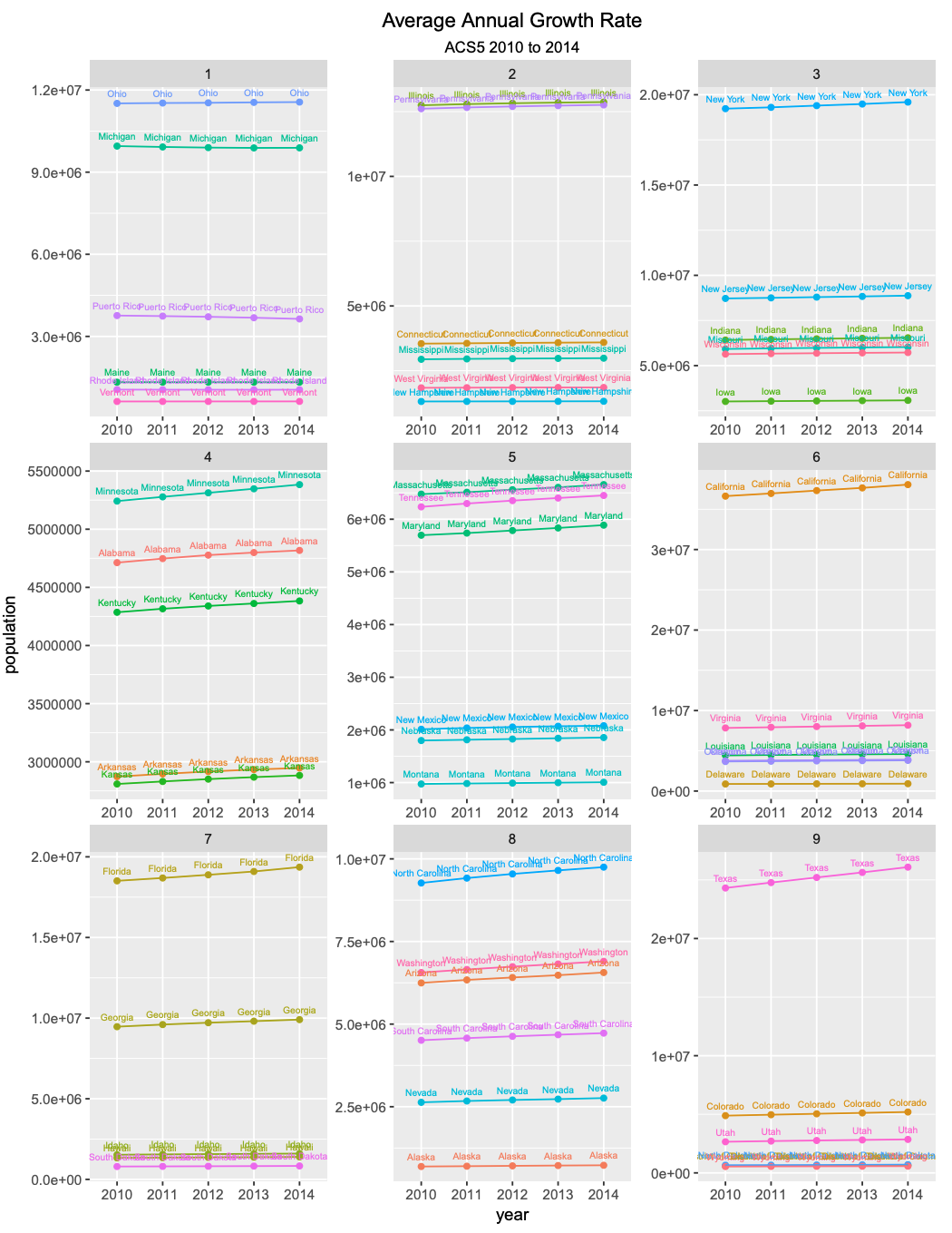
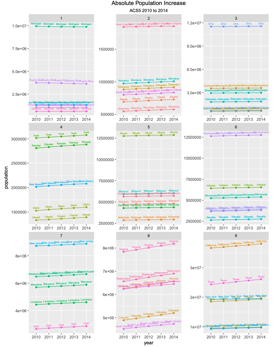
In part 1 of this project, I retrieved data public data from a remote server provided by the Federal Census Buraeu, using an API. The data I used was American Community Surveys 5-year data API, which contains the populations of 52 U.S. subdivisions. The first plot shows the absolute population increase between 2010 and 2014 of all 52 primary US subdivisions and facets this data into 9 quantiles. Similarly, the second plot shows the average annual growth rate between 2010 and 2014 of all 52 U.S. subdivisions, represented with 9 quantiles.
Part 2
Using the Stock Market to Describe, Analyze, and Predict
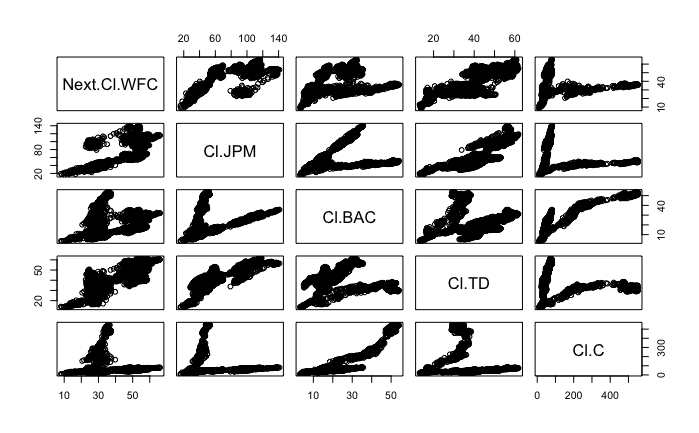
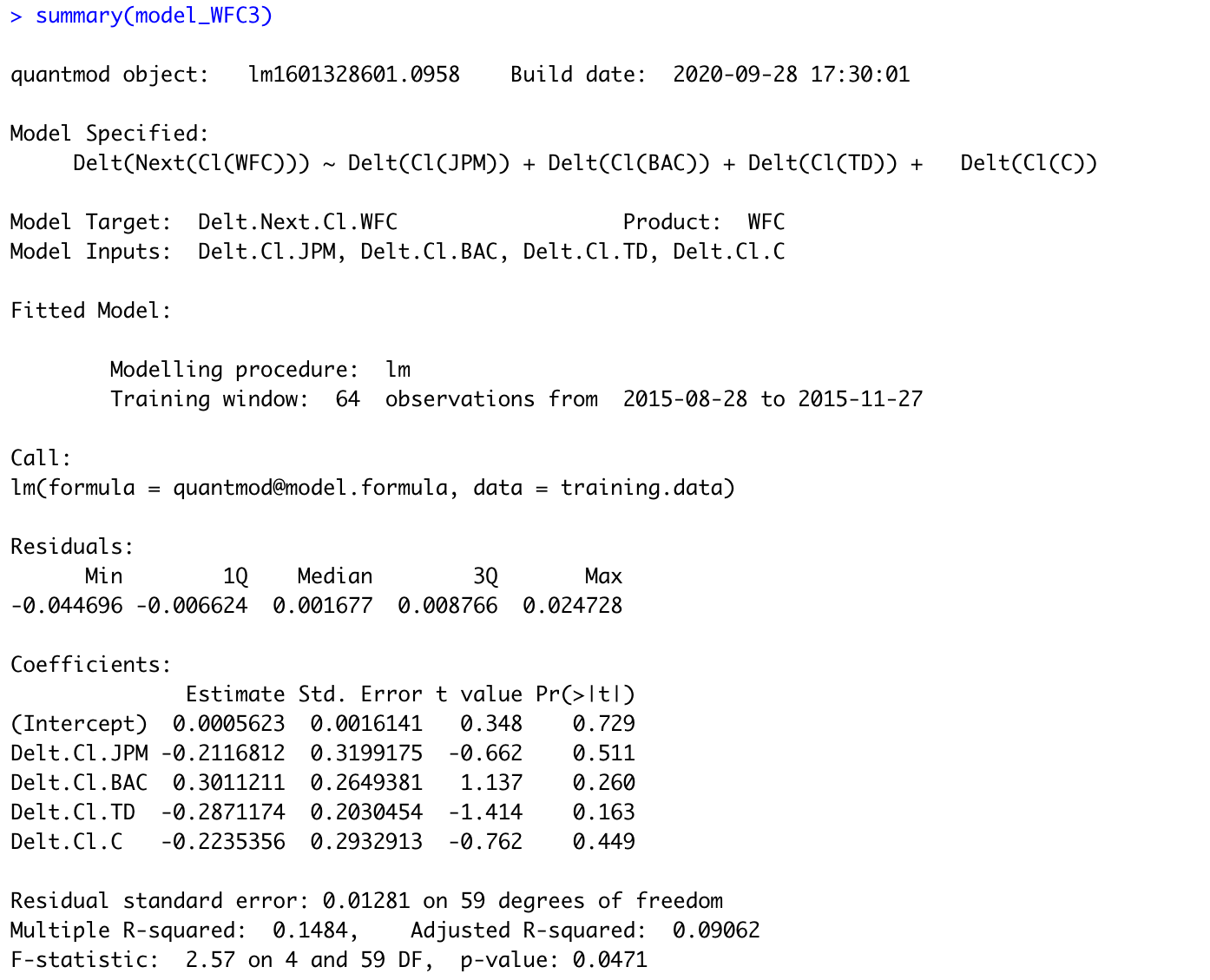
For part 2 of this project, I obtained stock data using the quantmod package, which allowed me to analyze and predict the data. I choose to examine publicly traded banks, specifically looking at Wells Fargo, JP Morgan, Bank of America, TD Bank, and Citi Bank, creating a statistical model. To predict Wells Fargo’s future stock price as the response variable, I used a more specific model with the current stock prices of the other banks as the predictor variables.
Part 3
Using tidyquant to Analyze Stock Performance
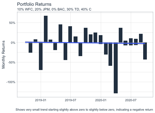
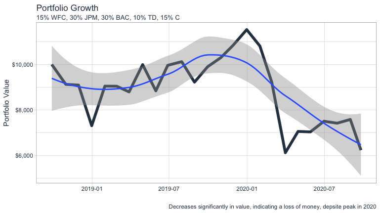
In part 3 of this project, I used the tidyquant package to analyze my portfolio of previously selected stocks. Then, I allocated a hypothetical $10,000 into my portfolio of stocks in order to maximize the total return on my investment. The plots below show the portfolio returns and the growth over a period of two years. Unfortunately, likely due to the COVID-19 pandemic, all stock indicated a negative return and ultimately a loss of money.
